2 The model
Our interest is in modeling a sequence of scatter plots measured over time. That is, we observe
\(Y_{it}\in\mathbb R^d\) for \(i=1,\ldots,n_t\) and \(t=1,\ldots,T\).
In continuous-time flow cytometry data, we notice that this data has two properties:
Each scatter plot looks approximately like a mixture of Gaussians.
The general clustering structure seen in each scatter plot is slowly varying over time.
To model data like this, we wish to fit a smoothly-varying mixture of Gaussians model:
\[ Y_{it}|\{Z_{it}=k\}\sim N_d(\mu_{kt},\Sigma_{kt})\qquad\mathbb P(Z_{it}=k)=\pi_{kt} \] where \((\mu_{kt},\Sigma_{kt},\pi_{kt})\) are slowly varying parameters.
The actual flow cytometry data that we will be working with will be binned data - the 3-d space is divided into a grid (\(Y_{it}\) will represent the location of the \(i\)th bin at time \(t\)), and for each bin at each point in time, we have a total carbon biomass - \(C _i^{(t)}\), which is estimated based on the number of cells in that grid, and the size of each of those cells. We will be interested in looking at how the total biomass for different populations evolve over time.
It will be useful to have data generated from this model for testing purposes, so we begin by defining a function for simulating from this model. For now, we give each point a biomass that is drawn from a normal distribution of mean 0.01 and standard deviation 0.001.
2.1 Generating data from model
#' Generate data from smoothly-varying mixture of Gaussians model
#'
#' The smoothly-varying mixture of Gaussians model is defined as follows:
#'
#' At time t there are n_t points generated as follows:
#'
#' Y_{it}|\{Z_{it}=k\} ~ N_d(mu_{kt},Sigma_{kt})
#' where
#' P(Z_{it}=k)=pi_{kt}
#' and the parameters (mu_{kt},Sigma_{kt}, pi_{kt}) are all slowly varying in time.
#'
#' This function generates Y and Z.
#'
#' @param mu_function a function that maps a vector of times to a T-by-K-by-d
#' array of means
#' @param Sigma_function a function that maps a vector of times to a
#' T-K-by-d-by-d array of covariance matrices
#' @param pi_function a function that maps a vector of times to a T-by-K vector
#' of probabilities
#' @param num_points a T vector of integers giving the number of points n_t to
#' generate at each time point t.
#' @param start_date the starting date for the generated data. This is created for when running a test requires dates.
#' @export
generate_smooth_gauss_mix <- function(mu_function,
Sigma_function,
pi_function,
num_points,
start_date = "2017-05-28 21:00:00 UTC") {
times <- seq_along(num_points)
mu <- mu_function(times)
Sigma <- Sigma_function(times)
pi <- pi_function(times)
K <- ncol(pi) # number of components
d <- dim(mu)[3]
dimnames(mu) <- list(NULL, paste0("cluster", 1:K), NULL)
z <- list() # z[[t]][i] = class of point i at time t
y <- list() # y[[t]][i,] = d-vector of point i at time t
biomass <- list() # biomass[[t]] = biomass of particles in each bin at time t
for (t in times) {
z[[t]] <- apply(stats::rmultinom(num_points[t], 1, pi[t, ]) == 1, 2, which)
y[[t]] <- matrix(NA, num_points[t], d)
biomass[[t]] <- abs(stats::rnorm(num_points[t], mean = 0.01, sd = sqrt(0.001)))
for (k in 1:K) {
ii <- z[[t]] == k # index of points in component k at time t
if (sum(ii) == 0) next
if (d == 1)
y[[t]][ii, ] <- stats::rnorm(n = sum(ii),
mean = mu[t, k, ],
sd = Sigma[t, k, , ])
else
y[[t]][ii, ] <- mvtnorm::rmvnorm(n = sum(ii),
mean = mu[t, k, ],
sigma = Sigma[t, k, , ])
}
}
# Generate dates spaced 1 hour apart
start_time <- as.POSIXct(start_date, tz = "UTC")
dates <- seq(start_time, by = "hour", length.out = length(y))
list(y = y, z = z, mu = mu, Sigma = Sigma, pi = pi, biomass = biomass, dates = dates)
}For now, we have
We have used two packages in this function, so let’s add these into our package.
## ✔ Adding 'stats' to Imports field in DESCRIPTION
## • Refer to functions with `stats::fun()`## ✔ Adding 'mvtnorm' to Imports field in DESCRIPTION
## • Refer to functions with `mvtnorm::fun()`Let’s generate simple examples in the \(d=1\) and \(d=3\) cases:
set.seed(123)
d <- 1; K <- 2; ntimes <- 200
ex1 <- list(
mu_function = function(times) {
mu <- array(NA, c(ntimes, K, d))
mu[, , 1] <- cbind(sin(2 * pi * times / 30), 2)
mu
},
Sigma_function = function(times) {
Sigma <- array(NA, c(ntimes, K, 1, 1))
Sigma[, , 1, 1] <- 0.25
Sigma
},
pi_function = function(times) {
pi1 <- seq(0.2, 0.8, length=length(times))
cbind(pi1, 1 - pi1)
},
num_points = rep(40, ntimes)
)
ex1$dat <- generate_smooth_gauss_mix(ex1$mu_function,
ex1$Sigma_function,
ex1$pi_function,
ex1$num_points)
d <- 3; K <- 4; ntimes <- 200
ex2 = list(
mu_function = function(times) {
mu <- array(NA, c(ntimes, K, d))
mu[, , 1] <- cbind(0.5*cos(2 * pi * times / 30), 0.3*sin(2 * pi * times / 30), sin(2 * pi * times / 30), -3)
mu[, , 2] = cbind (0.3*sin(2 * pi * times / 30), 2, -1, 0.6*cos(2 * pi * times / 30))
mu[, , 3] = cbind(2, 0.7*cos(2 * pi * times / 30), 0.4*sin(2 * pi * times / 30), 1)
mu
},
Sigma_function = function(times) {
Sigma <- array(NA, c(ntimes, K, d, d))
Sigma[, , 1, 1] <- 0.10
Sigma[, , 1, 2] <- 0
Sigma[, , 1, 3] <- 0
Sigma[, , 2, 1] <- 0
Sigma[, , 2, 2] <- 0.10
Sigma[, , 2, 3] <- 0
Sigma[, , 3, 1] <- 0
Sigma[, , 3, 2] <- 0
Sigma[, , 3, 3] <- 0.10
Sigma
},
pi_function = function(times) {
pi1 <- seq(0.2, 0.3, length=length(times))
cbind(pi1, pi1, 2*pi1/3, 1- (2*pi1 + 2*pi1/3))
},
num_points = rep(150, ntimes)
)
ex2$dat <- generate_smooth_gauss_mix(ex2$mu_function,
ex2$Sigma_function,
ex2$pi_function,
ex2$num_points)2.2 Visualizing the raw data
Let’s make a function for visualizing the data in the one-dimensional and three-dimensional cases.
The function will take as input the following argument:
We define this bit of documentation in its own code chunk so that it can be easily reused since multiple functions in the package take it as input.
#' Plot raw data
#'
<<y-param>>
#'
#' @export
plot_data <- function(y) {
d <- ncol(y[[1]])
if (d == 1){
y_label <- ifelse(is.null(colnames(y[[1]])), "V1", colnames(y[[1]]))
fig <- purrr::map_dfr(y, ~ tibble::tibble(y = .x), .id = "time") %>%
dplyr::mutate(time = as.numeric(.data$time)) %>%
ggplot2::ggplot(ggplot2::aes(x = .data$time, y = .data$y)) +
ggplot2::geom_point(alpha = 0.2) +
ggplot2::labs(x = "Time", y = y_label, title = "Raw Data")
}
else if (d == 3){
d <- ncol(y[[1]])
max_val <- list()
max_val_time <- list()
min_val = list()
min_val_time = list()
for (dd in seq(d)) {
max_val[[dd]] <- sapply(y, function(mat) max(mat[, dd]))
max_val_time[[dd]] <- max(max_val[[dd]])
min_val[[dd]] <- sapply(y, function(mat) min(mat[, dd]))
min_val_time[[dd]] <- min(min_val[[dd]])
}
y = unname(y)
# Determine axis labels
if (is.null(colnames(y[[1]]))) {
x_label <- "V1"
y_label <- "V2"
z_label <- "V3"
} else {
x_label <- colnames(y[[1]])[1]
y_label <- colnames(y[[1]])[2]
z_label <- colnames(y[[1]])[3]
}
y <- y %>%
purrr::map_dfr(~ tibble::tibble(x = .x[, 1], y = .x[, 2], z = .x[, 3]), .id = "time")
y$time = as.integer(y$time)
fig <- plotly::plot_ly(
data = y,
x = ~x, y = ~y, z = ~z,
type = "scatter3d", frame = ~time, mode = "markers", size = 80,
colors = colorRamp(c("blue", "red", "purple", "cyan", "magenta", "brown", "gray", "darkgreen", "darkblue", "darkred", "darkorange"))) %>%
plotly::layout(title = 'Raw Data', scene = list(
xaxis = list(range = c(1.1 * min_val_time[[1]], 1.1 * max_val_time[[1]]), title = x_label),
yaxis = list(range = c(1.1 * min_val_time[[2]], 1.1 * max_val_time[[2]]), title = y_label),
zaxis = list(range = c(1.1 * min_val_time[[3]], 1.1 * max_val_time[[3]]), title = z_label),
aspectmode = "manual",
aspectratio = list(x = 1, y = 1, z = 1) # Specify the fixed aspect ratio
))
}
return(fig)
}We’ve used some functions from other packages, so let’s include those in our package:
usethis::use_pipe()
usethis::use_package("purrr")
usethis::use_package("tibble")
usethis::use_package("dplyr")
usethis::use_package("ggplot2")
usethis::use_import_from("rlang", ".data")
usethis::use_package("plotly")
usethis::use_package("grDevices")## ✔ Adding 'magrittr' to Imports field in DESCRIPTION
## ✔ Writing 'R/utils-pipe.R'
## • Run `devtools::document()` to update 'NAMESPACE'## ✔ Adding 'purrr' to Imports field in DESCRIPTION
## • Refer to functions with `purrr::fun()`## ✔ Adding 'tibble' to Imports field in DESCRIPTION
## • Refer to functions with `tibble::fun()`## ✔ Adding 'dplyr' to Imports field in DESCRIPTION
## • Refer to functions with `dplyr::fun()`## ✔ Adding 'ggplot2' to Imports field in DESCRIPTION
## • Refer to functions with `ggplot2::fun()`## ✔ Adding 'rlang' to Imports field in DESCRIPTION
## ✔ Adding '@importFrom rlang .data' to 'R/flowkernel-package.R'
## ✔ Writing 'NAMESPACE'## ✔ Adding 'plotly' to Imports field in DESCRIPTION
## • Refer to functions with `plotly::fun()`## ✔ Adding 'grDevices' to Imports field in DESCRIPTION
## • Refer to functions with `grDevices::fun()`Let’s look at our two examples using this plotting function:
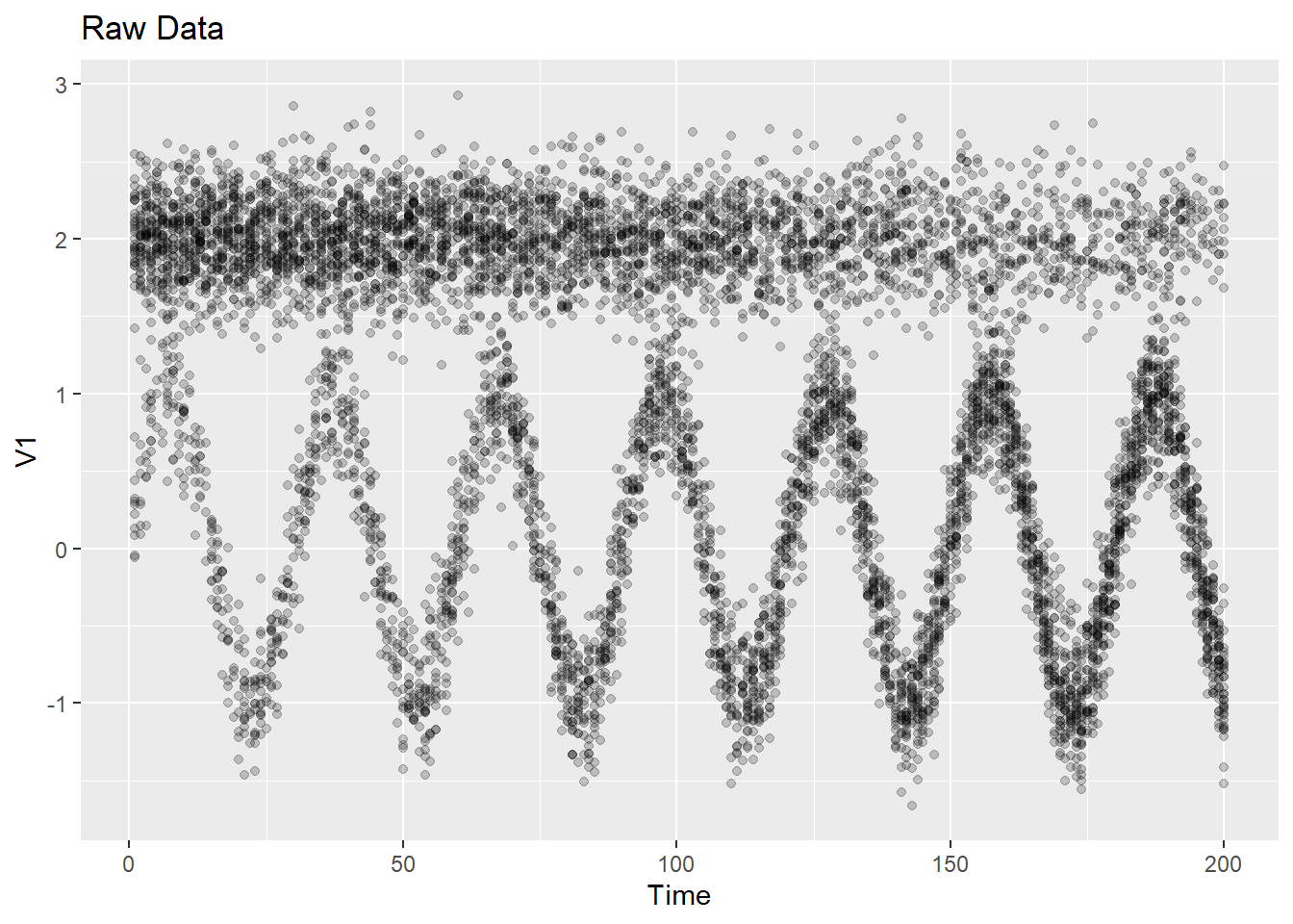
2.3 Visualizing data and model
We’ll also want a function for plotting the data with points colored by true (or estimated) cluster. And it will be convenient to also be able to superimpose the true (or estimated) means. The next function does this:
#' Plot data colored by cluster assignment with cluster means
<<y-param>>
#' @param z a length T list with `z[[t]]` being a n_t vector of cluster assignments
#' @param mu a T-by-K-by-d array of means
#' @param dim an integer which specifies which dimension of the data to plot. Defaults to a vector - `c(1:ncol(y[[1]]))` - that will plot all dimensions together
#' @param show_data a Boolean variable which determines whether data points are plotted along with the cluster centers or not. Defaults to `TRUE`
#' @export
plot_data_and_model <- function(y, z, mu, dim = c(1:ncol(y[[1]])), show_data = TRUE) {
d <- ncol(y[[1]])
K <- ncol(mu)
ntimes <- length(z)
if (d == 1) {
y_label <- ifelse(is.null(colnames(y[[1]])), paste0("V", dim), colnames(y[[1]])[dim])
df <- data.frame(time = seq_along(mu[, 1, 1]))
for (k in 1:ncol(mu)) {
col_name <- paste("Cluster", k)
df[[col_name]] <- mu[, k, 1]
}
plt <- ggplot2::ggplot(df, ggplot2::aes(x = time)) +
lapply(1:ncol(mu), function(k) {
ggplot2::geom_line(ggplot2::aes(y = df[, k + 1], color = paste("Cluster", k)), linetype = "solid")
}) +
ggplot2::labs(x = "Time", y = y_label) +
ggplot2::ggtitle("Model Means") +
ggplot2::scale_color_manual(name = "Cluster", values = rainbow(ncol(mu)))
fig <- plotly::ggplotly(plt, dynamicTicks = TRUE)
if (show_data == TRUE) {
dat_df <- purrr::map2_dfr(z, y, ~ tibble::tibble(z = as.factor(.x), y = .y), .id = "time") %>%
dplyr::mutate(time = as.numeric(.data$time))
means_df <- tibble::as_tibble(mu[, , 1]) %>%
dplyr::mutate(time = dplyr::row_number()) %>%
tidyr::pivot_longer(-.data$time, names_to = "cluster", values_to = "Mean") %>%
dplyr::mutate(cluster = as.factor(cluster))
fig <- ggplot2::ggplot() +
ggplot2::geom_line(
data = means_df,
ggplot2::aes(x = .data$time, y = .data$Mean, group = .data$cluster)
) +
ggplot2::geom_point(
data = dat_df,
ggplot2::aes(x = .data$time, y = .data$y, color = .data$z), alpha = 0.2
) +
ggplot2::labs(x = "Time", y = y_label, title = "Data and Model")
}
} else if (d == 3) {
z_dat <- unlist(z)
if (isTRUE(all.equal(dim, c(1, 2, 3)))) {
if (is.null(colnames(y[[1]]))) {
x_label <- "V1"
y_label <- "V2"
z_label <- "V3"
} else {
x_label <- colnames(y[[1]])[1]
y_label <- colnames(y[[1]])[2]
z_label <- colnames(y[[1]])[3]
}
max_val <- list()
max_val_time <- list()
min_val <- list()
min_val_time <- list()
for (dd in seq(d)) {
max_val[[dd]] <- sapply(y, function(mat) max(mat[, dd]))
max_val_time[[dd]] <- max(max_val[[dd]])
min_val[[dd]] <- sapply(y, function(mat) min(mat[, dd]))
min_val_time[[dd]] <- min(min_val[[dd]])
}
y <- y %>%
purrr::map_dfr(~ tibble::tibble(x = .x[, 1], y = .x[, 2], z = .x[, 3]), .id = "time") %>%
dplyr::mutate(z1 = z_dat) %>%
dplyr::mutate(time = as.integer(time))
cluster_data_frames <- vector("list", length = K)
for (kk in seq(K)) {
cluster_mean <- mu[, kk, ]
data <- data.frame(
X1 = cluster_mean[, 1],
X2 = cluster_mean[, 2],
X3 = cluster_mean[, 3],
time = 1:ntimes
)
cluster_data_frames[[kk]] <- data
}
if (show_data == FALSE) {
fig <- plotly::plot_ly(colors = colorRamp(c("blue", "orange", "red"))) %>%
plotly::layout(title = 'Model Means')
} else {
fig <- y %>% plotly::plot_ly(
x = ~x, y = ~y, z = ~z, color = ~z1,
type = "scatter3d", frame = ~time, mode = "markers", size = 80,
colors = colorRamp(c("blue", "orange", "red"))
) %>%
plotly::layout(title = 'Data and Model')
updatemenus <- list(
list(
active = 0,
type = 'buttons',
buttons = list(
list(
label = "Data Points",
method = "update",
args = list(list(visible = c(TRUE, rep(c(TRUE, TRUE), K))))
),
list(
label = "No Data Points",
method = "update",
args = list(list(visible = c(FALSE, rep(c(TRUE, TRUE), K))))
)
)
)
)
}
for (kk in seq(K)) {
fig <- fig %>%
plotly::add_markers(data = cluster_data_frames[[kk]], x = ~X1, y = ~X2, z = ~X3,
color = as.factor(kk), size = 120, frame = ~time)
if (show_data == TRUE) {
fig <- fig %>%
plotly::layout(updatemenus = updatemenus)
}
}
fig <- fig %>%
plotly::layout(scene = list(
xaxis = list(title = x_label, range = c(1.1 * min_val_time[[1]], 1.1 * max_val_time[[1]])),
yaxis = list(title = y_label, range = c(1.1 * min_val_time[[2]], 1.1 * max_val_time[[2]])),
zaxis = list(title = z_label, range = c(1.1 * min_val_time[[3]], 1.1 * max_val_time[[3]])),
aspectmode = "manual", # Set aspect ratio to manual
aspectratio = list(x = 1, y = 1, z = 1) # Specify the fixed aspect ratio
))
} else {
y_label <- ifelse(is.null(colnames(y[[1]])), paste0("V", dim), colnames(y[[1]])[dim])
df <- data.frame(time = seq_along(mu[, 1, 1]))
for (k in 1:ncol(mu)) {
col_name <- paste("Cluster", k)
df[[col_name]] <- mu[, k, dim]
}
plt <- ggplot2::ggplot(df, ggplot2::aes(x = time)) +
lapply(1:ncol(mu), function(k) {
ggplot2::geom_line(ggplot2::aes(y = df[, k + 1], color = paste("Cluster", k)), linetype = "solid")
}) +
ggplot2::labs(x = "Time", y = y_label) +
ggplot2::ggtitle("Cluster Means Over Time") +
ggplot2::scale_color_manual(name = "Cluster", values = rainbow(ncol(mu)))
fig <- plotly::ggplotly(plt, dynamicTicks = TRUE)
if (show_data == TRUE) {
y <- purrr::map(y, ~ .x[, dim, drop = FALSE])
dat_df <- purrr::map2_dfr(z, y, ~ tibble::tibble(z = as.factor(.x), y = .y), .id = "time") %>%
dplyr::mutate(time = as.numeric(.data$time))
means_df <- tibble::as_tibble(mu[, , dim]) %>%
dplyr::mutate(time = dplyr::row_number()) %>%
tidyr::pivot_longer(-.data$time, names_to = "cluster", values_to = "Mean") %>%
dplyr::mutate(cluster = as.factor(cluster))
fig <- ggplot2::ggplot() +
ggplot2::geom_line(
data = means_df,
ggplot2::aes(x = .data$time, y = .data$Mean, group = .data$cluster)
) +
ggplot2::geom_point(
data = dat_df,
ggplot2::aes(x = .data$time, y = .data$y, color = .data$z), alpha = 0.2
) +
ggplot2::labs(x = "Time", y = y_label, title = "Data and Model")
}
}
}
return(fig)
}We used a function from tidyr, so let’s include this package:
## ✔ Adding 'tidyr' to Imports field in DESCRIPTION
## • Refer to functions with `tidyr::fun()`For now we can use this to visualize the true model, although later this will be useful for visualizing the estimated model. We first plot the 1-d data, with and without the data points:
plot_data_and_model(ex1$dat$y, ex1$dat$z, ex1$dat$mu)
plot_data_and_model(ex1$dat$y, ex1$dat$z, ex1$dat$mu, show_data = FALSE)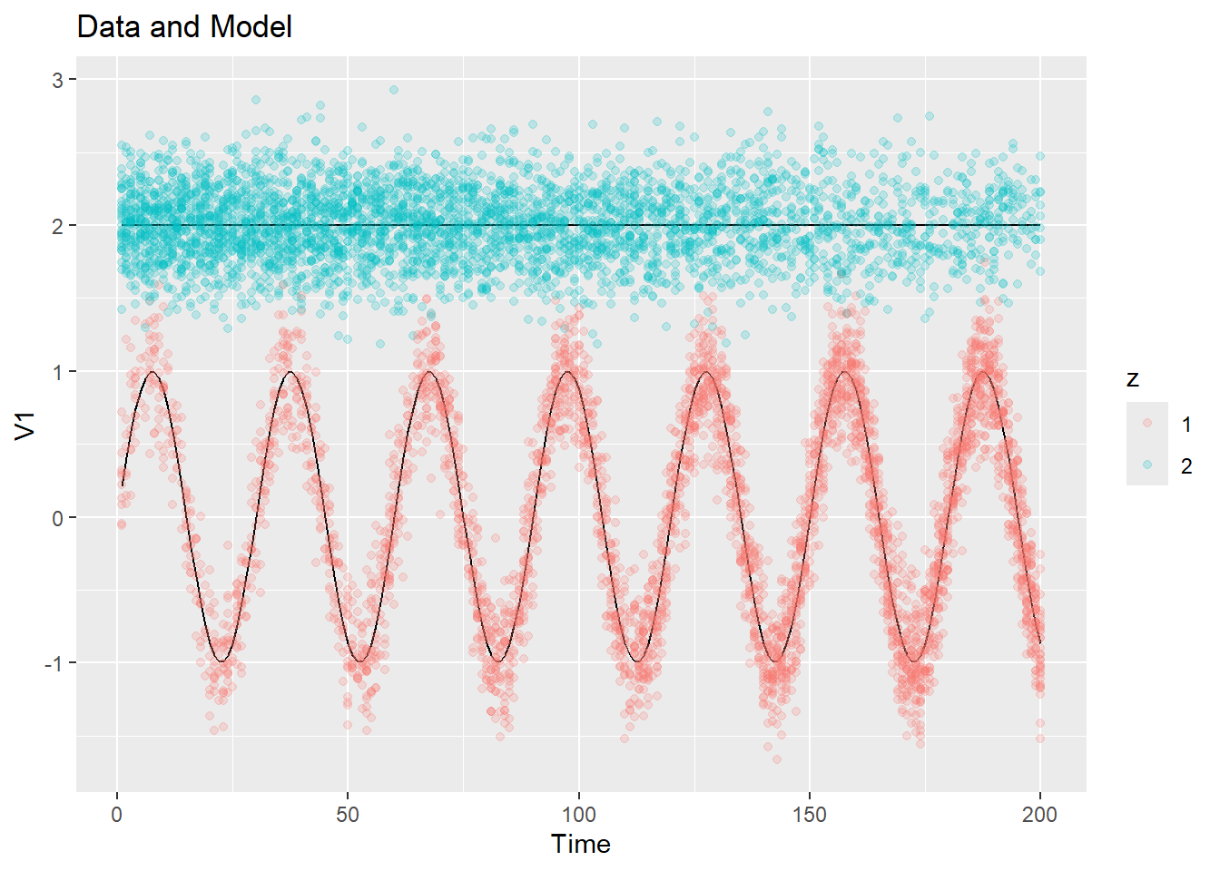
We next look at the 3-d example. There are a few different ways in which this function can be used. We can plot the entire data with the cluster means and assignments as a 3-d animation, and we can also choose to leave out the data points themselves and just look at how the cluster centers evolve with time (the entire point with the data points can be too crowded with real data):
plot_data_and_model(ex2$dat$y, ex2$dat$z, ex2$dat$mu)
plot_data_and_model(ex2$dat$y, ex2$dat$z, ex2$dat$mu, show_data = FALSE)We can also use this function to plot 1-d projections of the 3-d data, with and without the data points:
plot_data_and_model(ex2$dat$y, ex2$dat$z, ex2$dat$mu, dim = 1, show_data = FALSE)
plot_data_and_model(ex2$dat$y, ex2$dat$z, ex2$dat$mu, dim = 2)
plot_data_and_model(ex2$dat$y, ex2$dat$z, ex2$dat$mu, dim = 2, show_data = FALSE)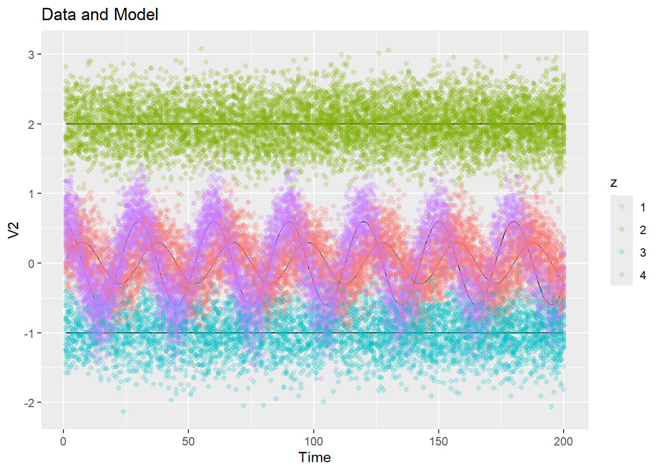
We would also like to see how the \(\pi_{kt}\)’s evolve with time, and how the biomass of a particular cluster evolves over time. Let’s add these functions to our package.
#' Plot cluster populations (pi) over time
#' @param pi A T-by-K array, with each row consisting of probabilities that sum to one
#' @export
plot_pi <- function(pi) {
# Create an empty data frame
df <- data.frame(time = seq_along(pi[, 1]))
# Use a for loop to append each column to the data frame
for (k in 1:ncol(pi)) {
col_name <- paste("Cluster", k)
df[[col_name]] <- pi[, k]
}
# Create the ggplot with multiple line plots
pi_plt <- ggplot2::ggplot(df, ggplot2::aes(x = time)) +
lapply(1:ncol(pi), function(k) {
ggplot2::geom_line(ggplot2::aes(y = df[, k + 1], color = paste("Cluster", k)), linetype = "solid")
}) +
ggplot2::labs(x = "Time", y = "Pi") +
ggplot2::ggtitle("Pi Over Time") +
ggplot2::scale_color_manual(name = "Cluster", values = rainbow(ncol(pi)))
# Convert ggplot to plotly for interactivity
fig <- plotly::ggplotly(pi_plt, dynamicTicks = TRUE)
return(fig)
}plot_pi(ex2$dat$pi)If we want to plot all three dimensions together, we can use the following function:
#' Plot cluster means as 1-d projection over time, with all three dimensions plotted together, in separate plots
#' @param mu a T-by-K-by-d array of means
#' @export
plot_1d_means_triple <- function(y, mu) {
# Convert the 3D array into a long data frame for ggplot2
long_df <- data.frame(
time = rep(seq_along(mu[, 1, 1]), times = ncol(mu) * dim(mu)[3]),
value = as.vector(mu),
cluster = factor(rep(rep(1:ncol(mu), each = dim(mu)[1]), times = dim(mu)[3])),
dimension = factor(rep(rep(1:dim(mu)[3], each = dim(mu)[1] * ncol(mu)), times = 1))
)
if (is.null(colnames(y[[1]]))) {
label_1 <- "V1"
label_2 <- "V2"
label_3 <- "V3"
} else {
label_1 <- colnames(y[[1]])[1]
label_2 <- colnames(y[[1]])[2]
label_3 <- colnames(y[[1]])[3]
}
# Create the labels for the facets
facet_labels <- c("1" = label_1, "2" = label_2, "3" = label_3)
# Calculate the range for each dimension
range_df <- long_df %>%
dplyr::group_by(dimension) %>%
dplyr::summarize(min_value = min(value), max_value = max(value)) %>%
dplyr::mutate(padding = 0.1 * (max_value - min_value),
y_min = min_value - padding,
y_max = max_value + padding)
# Merge the range information back to the long data frame
long_df <- merge(long_df, range_df, by = "dimension")
# Create the ggplot with facet_grid and custom y-limits for each plot
plt <- ggplot2::ggplot(long_df, ggplot2::aes(x = time, y = value, color = cluster)) +
ggplot2::geom_line() +
ggplot2::labs(x = "Time", y = "Value") +
ggplot2::facet_grid(dimension ~ ., scales = "free_y", labeller = ggplot2::labeller(dimension = facet_labels)) +
ggplot2::ggtitle("Cluster Means Over Time") +
ggplot2::scale_color_manual(name = "Cluster", values = rainbow(ncol(mu))) +
ggplot2::geom_blank(ggplot2::aes(y = y_min)) + # Add blank points for custom y-limits
ggplot2::geom_blank(ggplot2::aes(y = y_max))
return(plt)
}Here is an example of running this function:
plot_1d_means_triple(ex2$dat$y, ex2$dat$mu)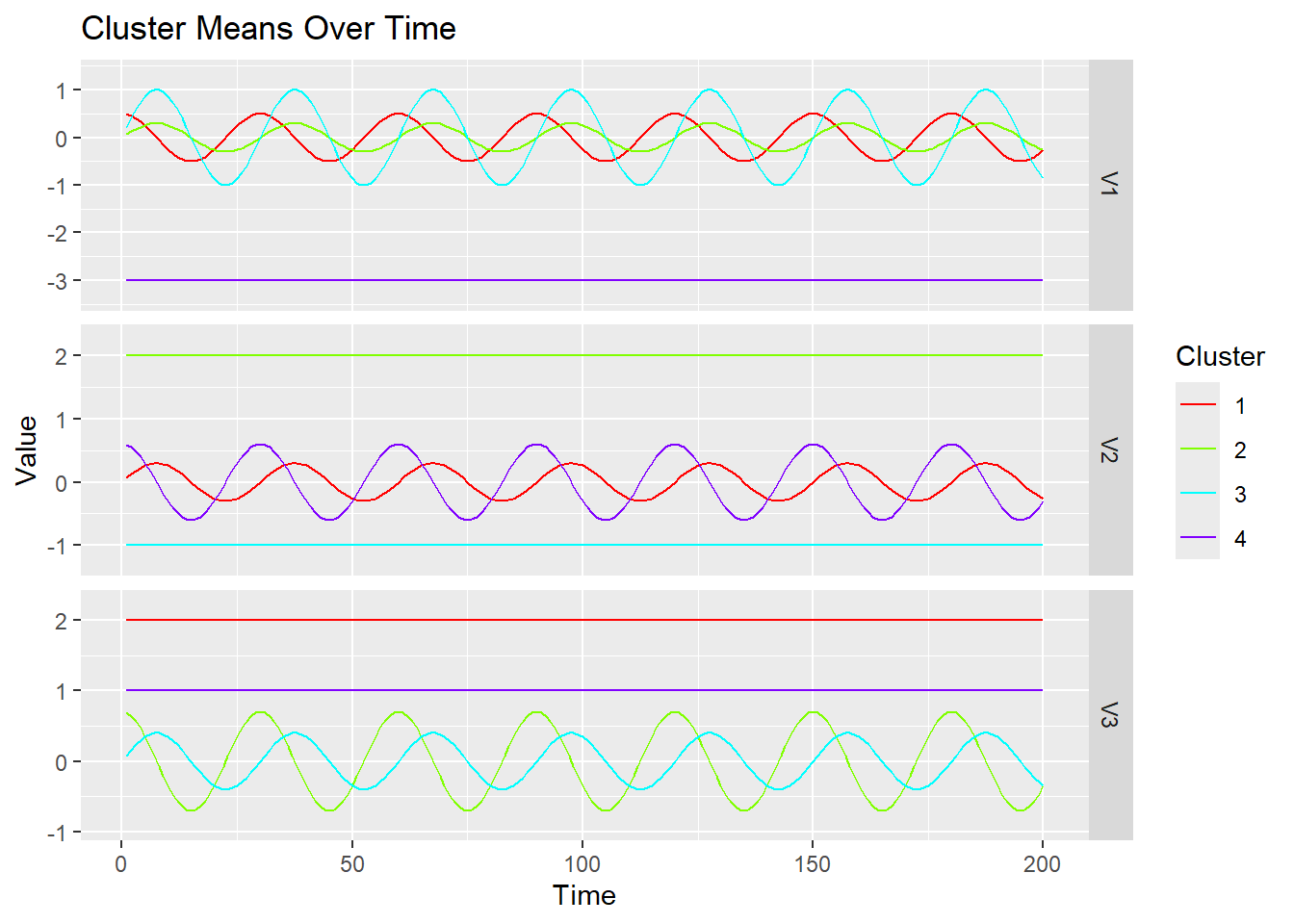
We now add two more plotting functions to our package: one that plots the 1-d means as above, but with the width of each line varying according to pi of each cluster, and another to plot the total biomass over time for each cluster.
#' Plot cluster means as 1-d projection over time, with line widths determined by pi
#' @param mu a T-by-K-by-d array of means
#' @param pi A T-by-K array, with each row consisting of probabilities that sum to one
#' @export
plot_1d_means_with_width <- function(y, mu, pi, dim = 1) {
y <- purrr::map(y, ~ .x[, dim, drop = FALSE])
y_label <- ifelse(is.null(colnames(y[[1]])), paste0("V", dim), colnames(y[[1]])[dim])
# Create an empty data frame
df <- data.frame(time = seq_along(pi[, 1]))
# Use a for loop to append each column to the data frame
for (k in 1:ncol(mu)) {
col_name <- paste("Cluster", k)
df[[col_name]] <- mu[, k, dim]
}
# Create the ggplot with multiple line plots
fig <- ggplot2::ggplot(df, ggplot2::aes(x = time)) +
lapply(1:ncol(mu), function(k) {
ggplot2::geom_line(ggplot2::aes(y = df[, k + 1], color = paste("Cluster", k), linewidth = pi[, k]), linetype = "solid")
}) +
ggplot2::labs(x = "Time", y = y_label) +
ggplot2::ggtitle("Cluster Means Over Time") +
ggplot2::scale_color_manual(name = "Cluster", values = rainbow(ncol(mu))) +
ggplot2::guides(linewidth = "none") # To remove the linewidth legend
return(fig)
}plot_1d_means_with_width(ex2$dat$y, ex2$dat$mu, ex2$dat$pi, dim = 1)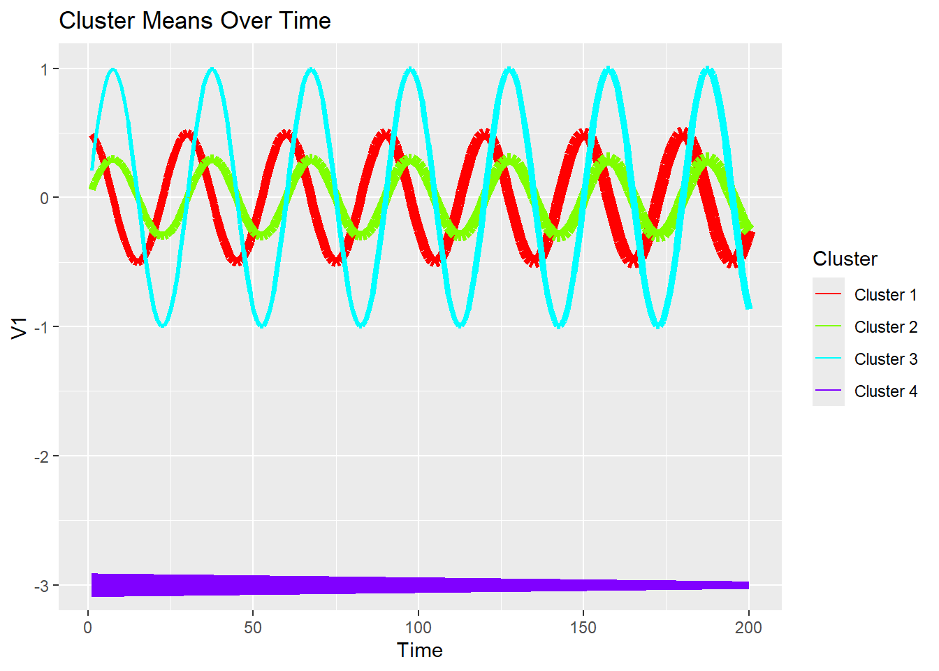
Let’s also create a function to plot the biomass of each cluster over time. We will run this function later when we have responsibilities defined:
#' Plot biomass over time for each cluster
#' @param biomass A list of length T, where each element `biomass[[t]]` is a numeric vector of length n_t containing the biomass (or count) of particles in each bin
#' @param resp length T list with `y[[t]]` being a n_t-by-K matrix
#' @export
plot_biomass <- function(biomass, resp) {
K <- ncol(resp[[1]])
ntimes <- length(resp)
# Initialize a list to hold data frames for each cluster
data_list <- vector("list", K)
for (k in 1:K) {
cluster_biomass <- sapply(1:ntimes, function(tt) sum(resp[[tt]][, k] * biomass[[tt]]))
data_list[[k]] <- data.frame(time = seq_along(cluster_biomass), Cluster = paste("Cluster", k), Biomass = cluster_biomass)
}
# Combine all the data frames into one
df <- do.call(rbind, data_list)
# Create the ggplot with multiple line plots
plt <- ggplot2::ggplot(df, ggplot2::aes(x = time, y = Biomass, color = Cluster)) +
ggplot2::geom_line() +
ggplot2::labs(x = "Time", y = "Cluster Biomass") +
ggplot2::ggtitle("Cluster Biomass Over Time")
# Convert ggplot to plotly for interactivity
pi_plotly <- plotly::ggplotly(plt, dynamicTicks = TRUE)
return(pi_plotly)
}